00:00
/
00:00
Positioning an open-source software pioneer for explosive growth
Callstack
2024
When Callstack, the European software disruptor, maxed out their ability to sustainably acquire new leads using performance marketing, they turned to Creative Business Co to unlock the commercial value of their brand and find more profitable ways to grow. That meant refreshing their messaging so they could build relevance with senior technology decision makers who cared more about business outcomes than developer code and creating a new visual identity that would help them stand out.
Challenge
While Callstack had established awareness and authority with developers through their regular contributions to the Open Source community, they struggled to engage with senior non-technical stakeholders (usually key decision makers in large businesses) making it difficult to close larger enterprise deals. Our challenge was to help a highly technical organization clearly articulate their business value, in a more human and simple way.

Insight
Callstack wasn’t your run-of-the mill software developer. You see, they (alongside Meta) were architects of React Native - a programming language for mobile apps. That meant they didn’t just think about apps, but the broader context within which software is used and built; the skillsets of employees, the structures of teams, the culture that surrounds it all. We felt this was a bigger story that needed to be told - both verbally and visually.


Strategy
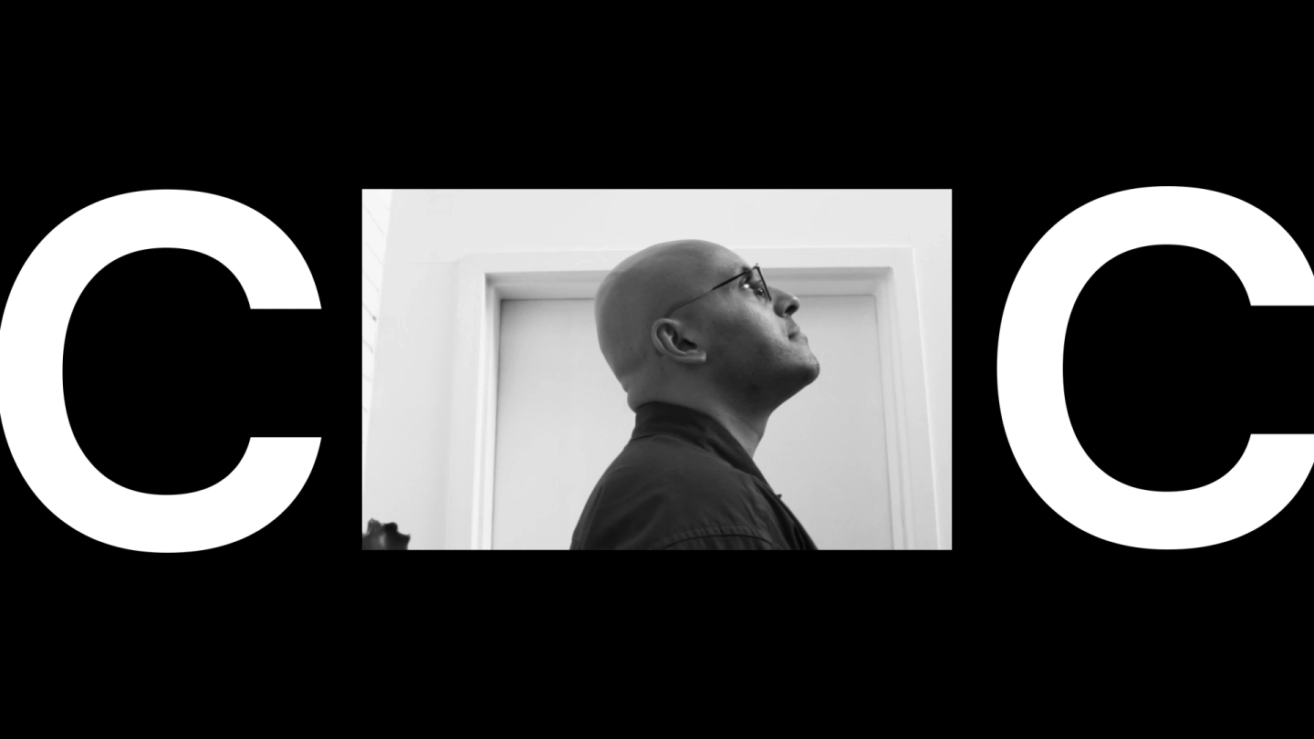
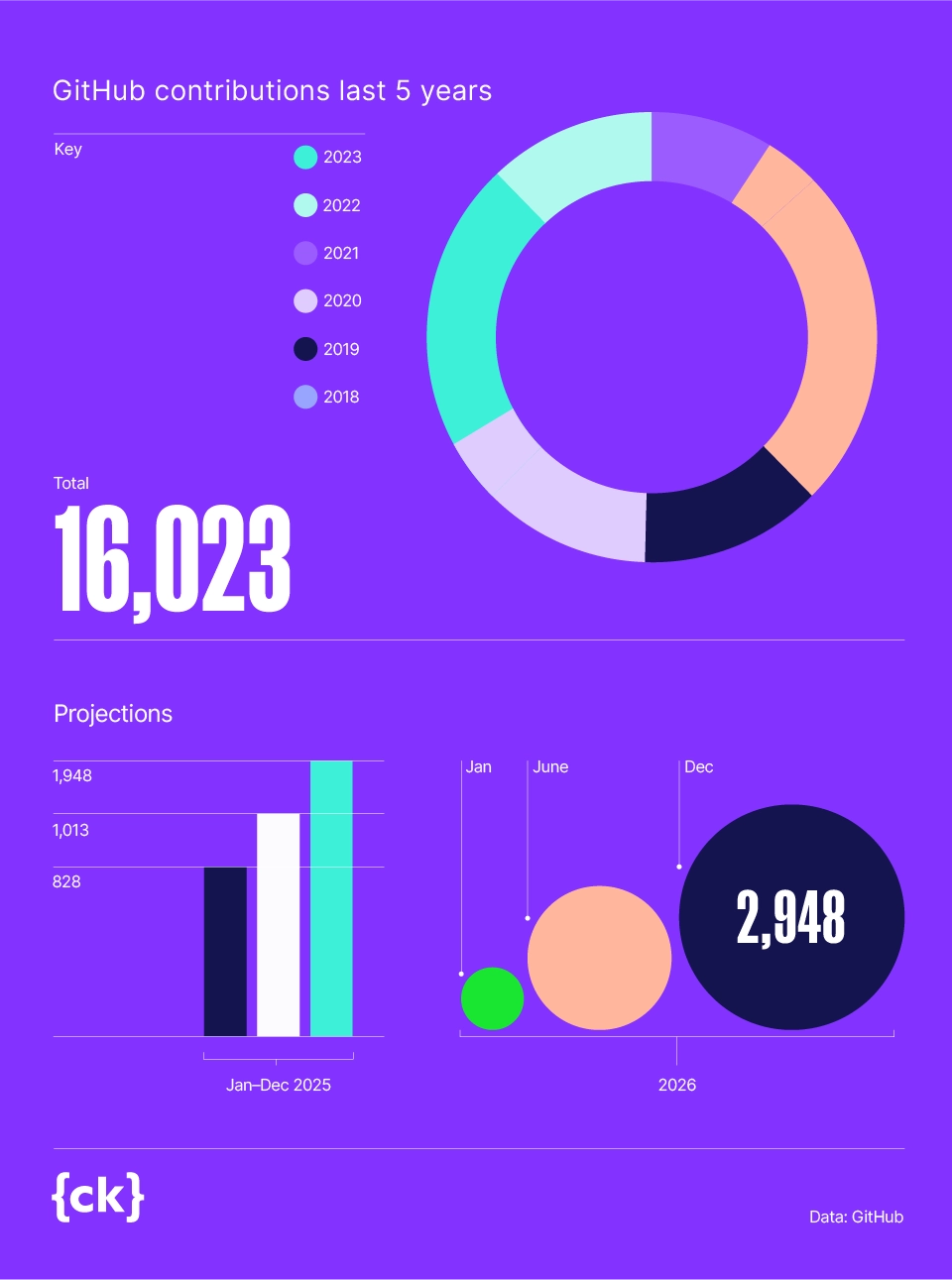
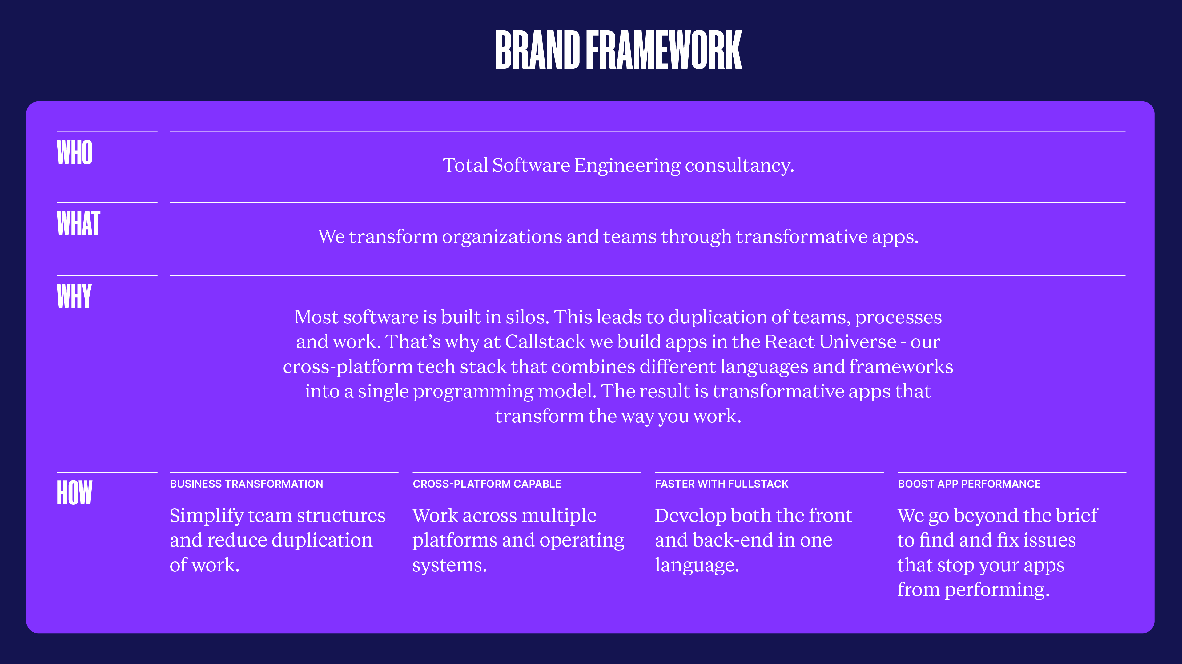
We decided to brand their unique philosophy and approach. We called it ‘Total Software Engineering’ and behind it was a big idea that proclaimed that great software has the ability to shape its surroundings. Through thoughtful app design, businesses could break down silos, streamline teams and simplify how they work. While not only differentiating Callstack from their competitors, our strategy would allow Callstack to shift their messaging from the technicalities of their coding approach, to business benefits that senior non-technical stakeholders cared about.

Visual Identity
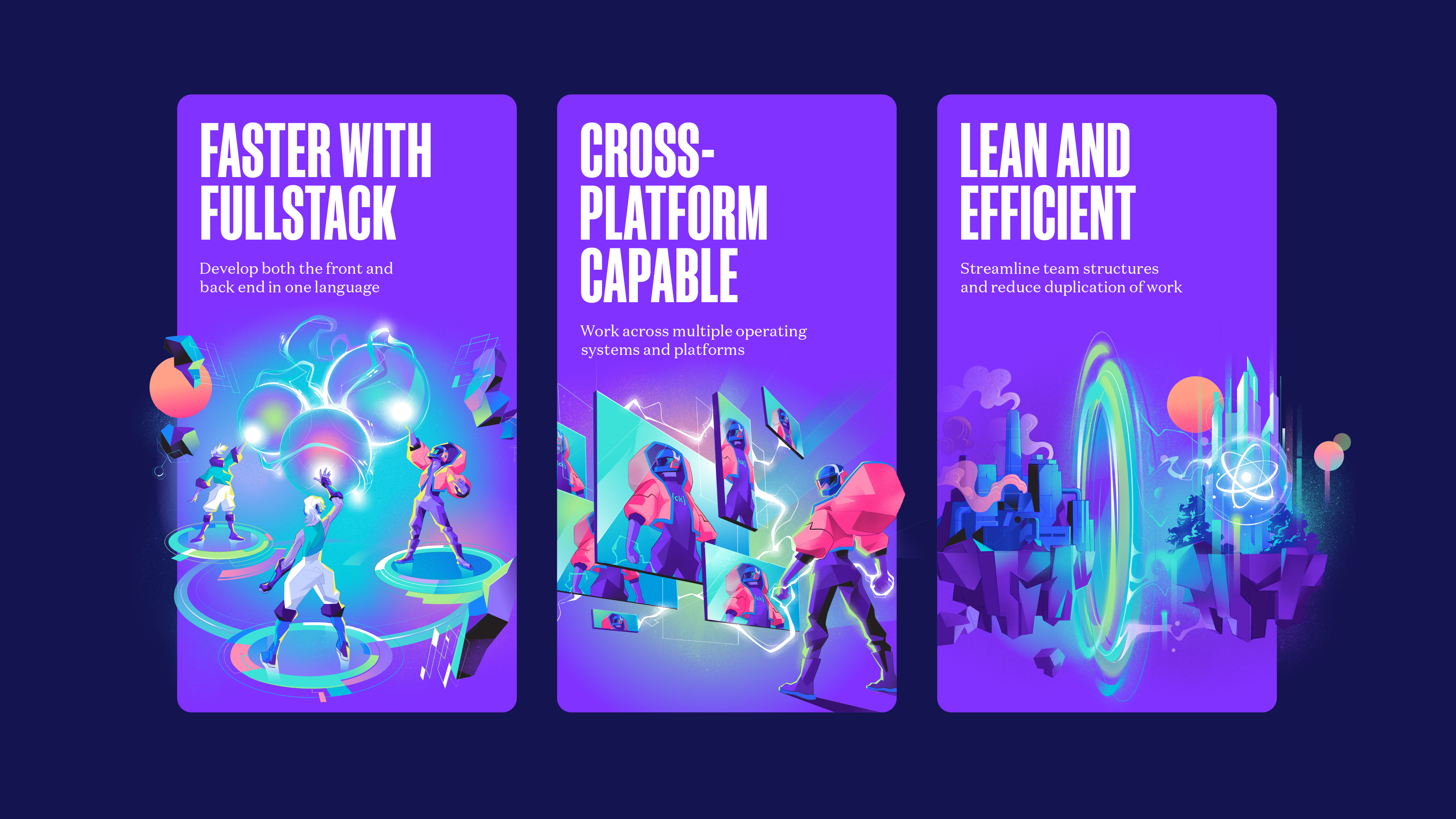
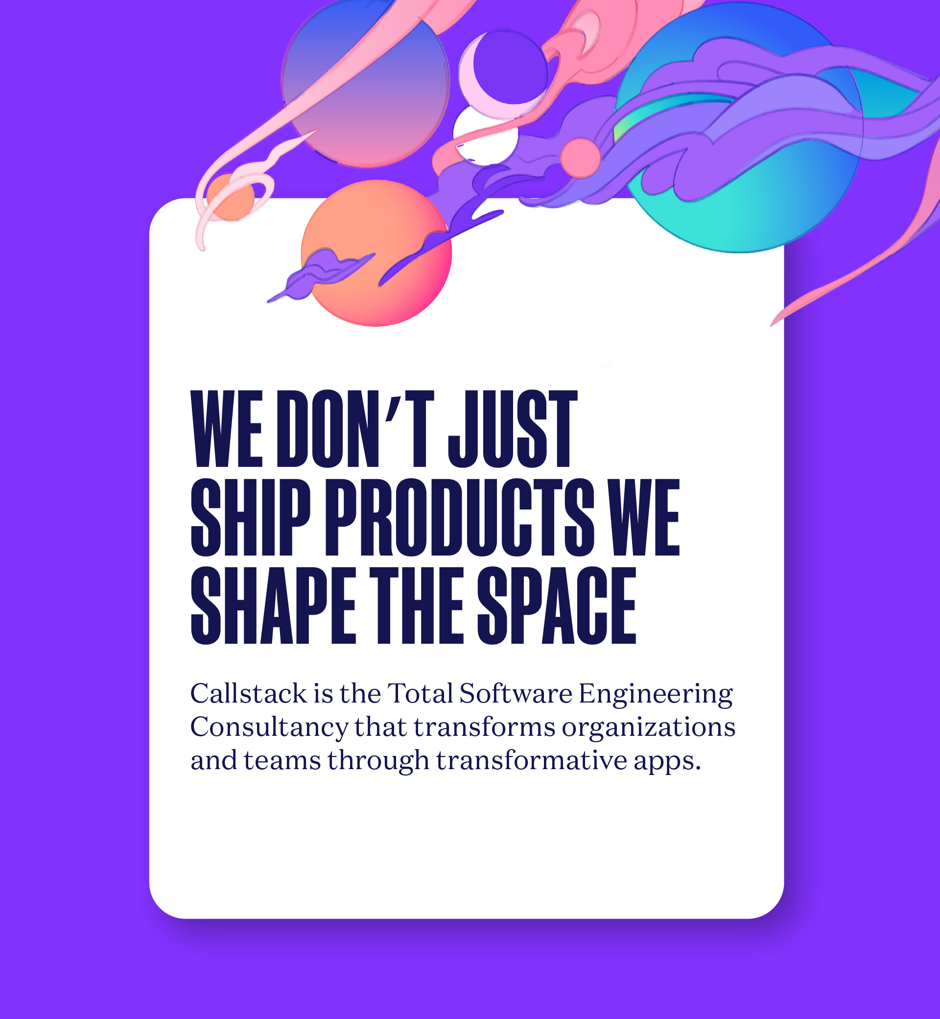
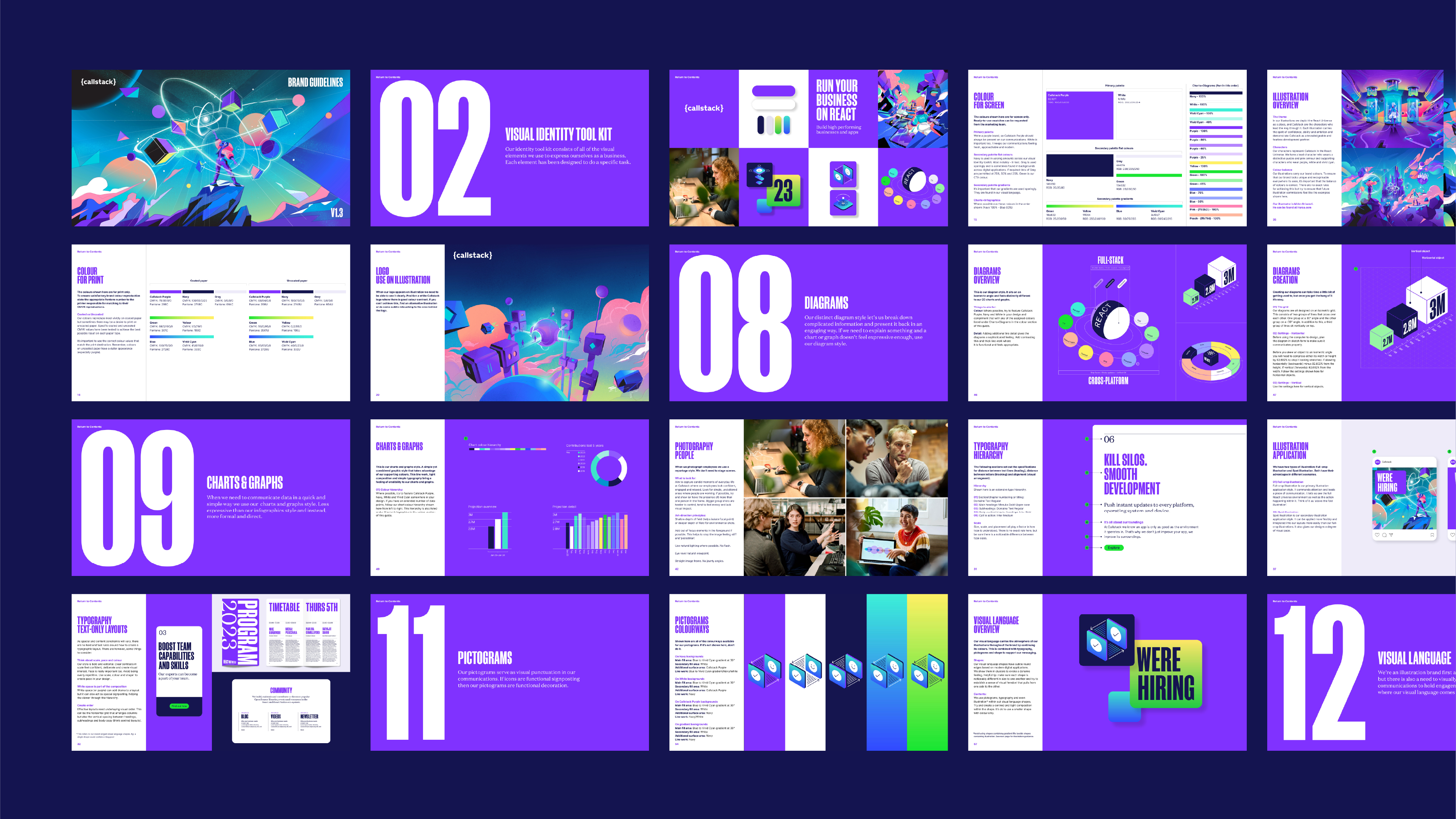
Using buildings and cities as a metaphor for businesses, we created a unique visual universe that brought our positioning “Total Software Engineering” to life. The protagonists of the universe are Callstack developers, who have the power to shape the landscape for the better.
Previously, Callstack were leading with a deep navy colour across their materials. It created a secretive and anti-social atmosphere. Our move to purple and white set up the right conditions for Callstack to express themselves as a fresh, modern business who’s employees are skilled, client-facing representatives.
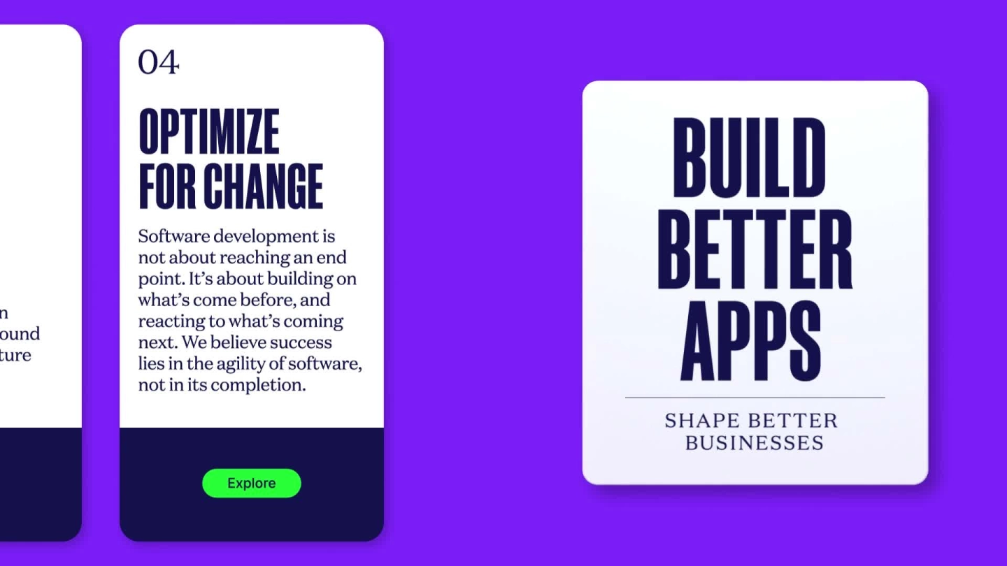
When choosing a typographic style there were two specific objectives we wanted to meet; Firstly, it needed a bold confidence to communicate Callstack’s point of view around software development and its implementation within their clients’ businesses. And secondly, it needed to feel appropriate within the Universe theme while appearing credible and grown up.



Activation
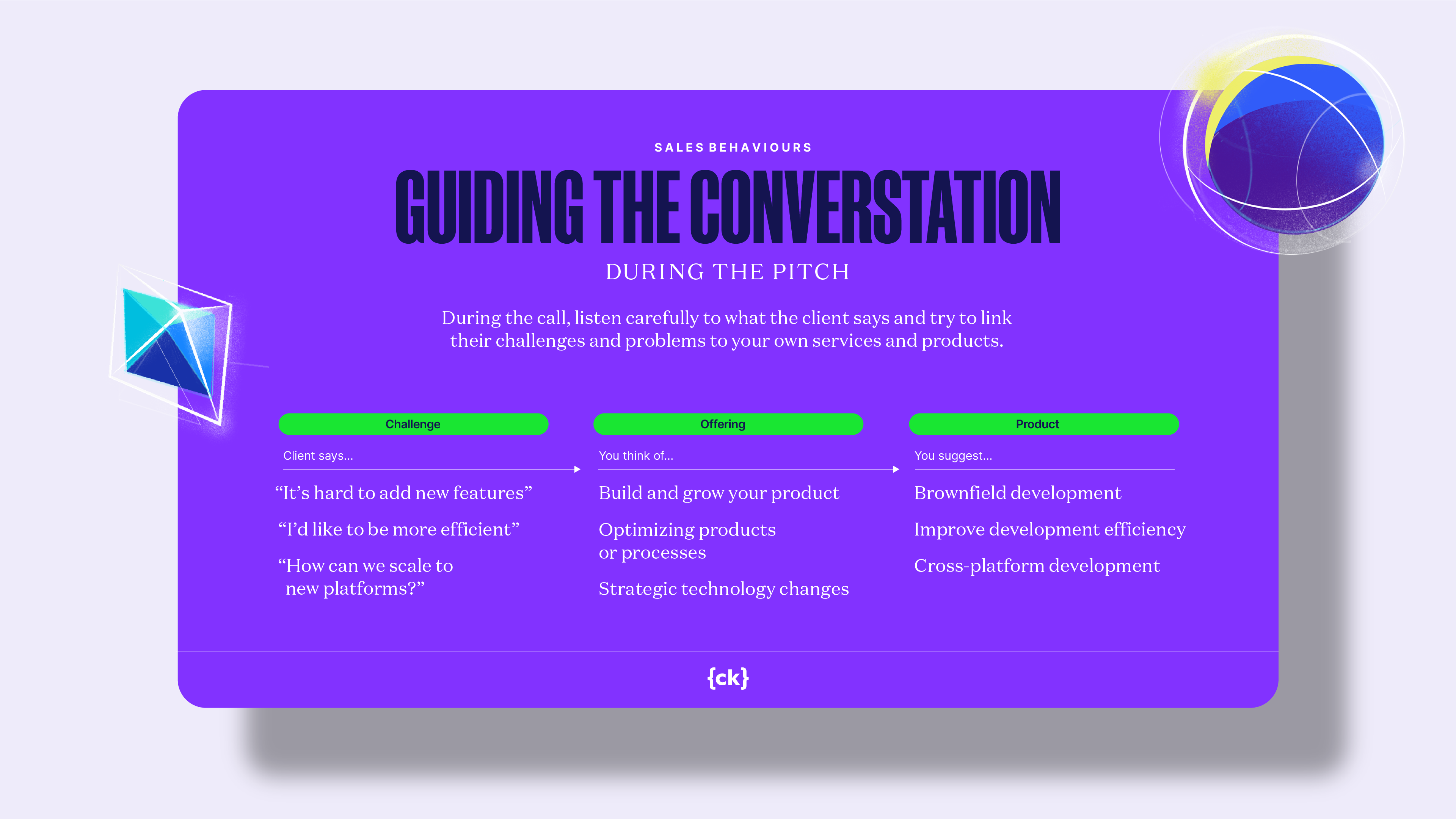
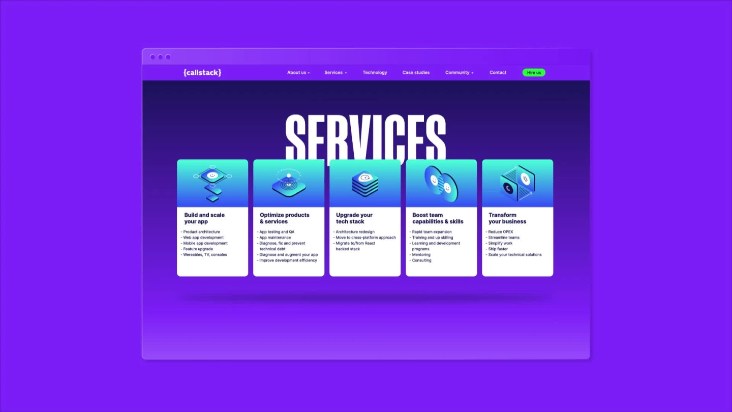
The new brand strategy led to a broader business transformation for Callstack. First, we helped the team radically simplify their portfolio of offerings, making it easier for senior decision makers to navigate, understand and discover. Second, we created tools and training for the sales team that would help them articulate the broader “Total Software Engineering” story and the business benefits that came from working with Callstack. Finally, we led the redesign of Callstack’s website and all go-to-market materials to drive better conversion across all stages of the funnel.
“For anyone cautiously considering brand, CBC are THE GUYS FOR YOU. Software developers are typically brand skeptical, but with logic, a lot of persistence, and their famous no B.S. approach, CBC managed to transform our leadership team from brand skeptics to brand advocates. I consider them essential partners helping power Callstack’s next phase of growth.”